Website development best practices change very rapidly. As each new browser version and new device hit the market, they bring complexities to the process of ensuring your site is viewable everywhere online.
Best practices tend to focus on troubleshooting for the various types of browsers and on devices that make up the greatest marketshare, or the most likely user types of your prospective audience. From smartphones, to tablets, desktops and laptops to TV screens we all want our website to look good across all platforms.
That explains why Responsive Web Design (RWD) is the current trend. Responsive Web Design eliminates the need to have separate mobile and tablet versions of your website (or even your app) – a site with RWD technology can respond to the device it is appearing on automatically, providing an optimal viewing experience.
RWD features a fluid grid structure and flexible image sizing that makes your content look truly the way it is supposed to across the three currently most used screen types; desktop computer monitors, mobile and tablet. Responsive Technology can be integrated with most of the widely used content management systems allowing your content to be consistent across devices adjusting to the users platform, orientation and screen size.
Below are some recent examples of responsive websites by Big Idea.
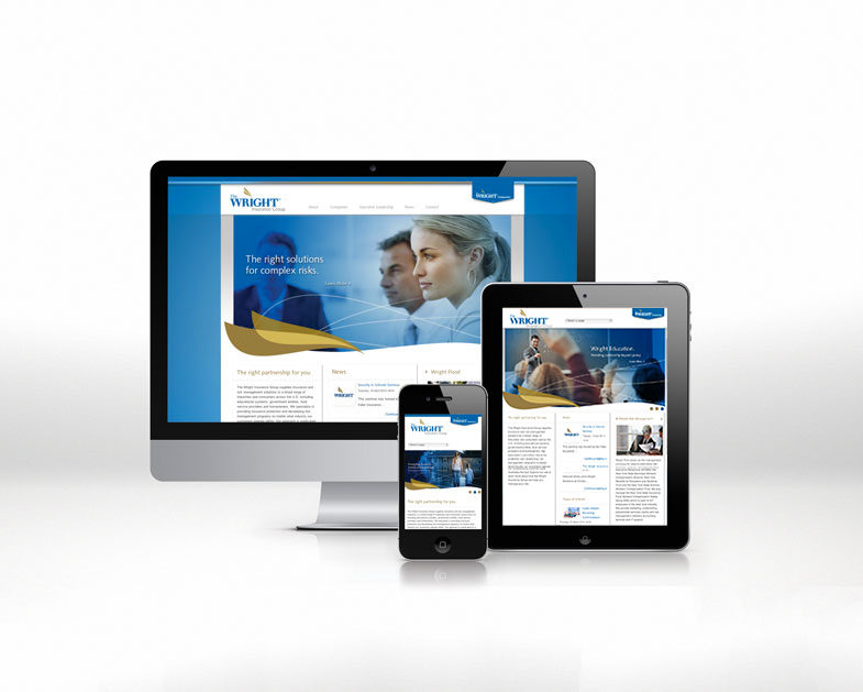 A responsive web design adjusts to the screen size of the device that it is being viewed on, as with The Wright Insurance Group family of companies website and the Up to Us by the Peter G. Peterson Foundation website

